Text Entry Box too Small
Submitted by EastsideVetEmerg on Sun, 07/07/2013 - 19:44
Hi,
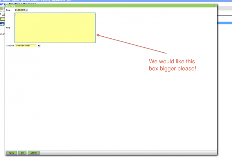
We find it quite irritating how small the text entry box is. Virtually every time we need to enter text we need to make this box larger.
Is there any way to make this box larger permanently? Ideally to fit the available screen real estate.
Thanks,
Adrian
PS. Photo below to explain what I mean...


Re: Text Entry Box too Small
Is the patient clinical Note the only one that needs to be resized?
-Tim
Re: Text Entry Box too Small
Hi,
This is the main one, but the other one that would be useful is the input boxes for fields in OO or Word documents.
I guess as a matter of principal, if possible, the input boxes should expand to fill the available space.
Cheers,
Adrian
Re: Text Entry Box too Small
Take a look at the Note editor in the 1.7 alpha version: http://demo.openvpms.org/alpha/login
In general, its possible to fill the available width, but the height must be set explictly. In some cases (as with the Note editor) this needs to be done for each supported screen resolution.
Can you post a screenshot for the input boxes, or the template you are using?
-Tim
Re: Text Entry Box too Small
Hi Tim,
That looks great, much better and extra good if we can also set a height.
In terms of the input boxes this is one example. I acutally hope we can eliminate the need for multiple boxes once 1.7 is released (any ETA on this? Can we be a test dummy?) and we can use conditional formating and advanced macros more widely. Then I can more effectively create discharge statements within OpenVPMS insert them into a single input box that then gets inserted into an OO document.
Re: Text Entry Box too Small
A beta of 1.7 should be available in early August.
Send me your email address to tma @ netspace dot net dot au and I'll send you the latest snapshot via Dropbox.
Regards,
Tim
Re: Text Entry Box too Small
Will do! Thank you.